Accordion
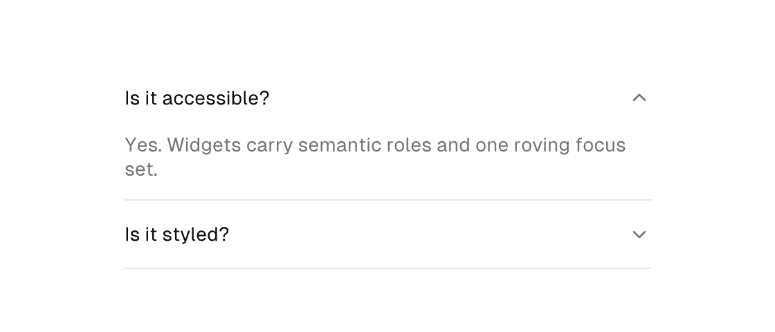
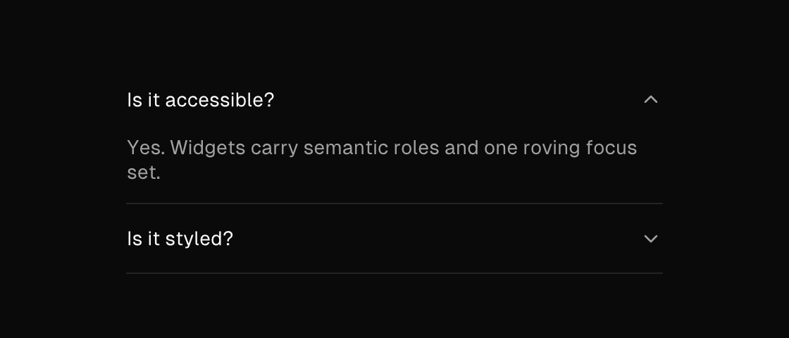
A disclosure surface with a header. The header label comes from the text attribute, children show while selected is true, and a header press dispatches on-toggle — the model owns the open state, in the usual model–message loop. Items render the house accordion look — borderless rows divided by hairline separators, with the chevron on the trailing edge rotating as the item expands — and size themselves: the header band alone while closed, header plus content while open, so a toggle reflows the column with no hand-managed heights.
accordion
Markup
<column width="380">
  <accordion text="Is it accessible?" selected="{faq_open}" on-toggle="toggle_faq">
    <column>
      <text wrap="true" foreground="text_muted">Yes. Widgets carry semantic roles and one roving focus set.</text>
    </column>
  </accordion>
  <accordion text="Is it styled?" on-toggle="toggle_styling" />
</column>
Zig builder
ui.column(.{ .width = 380 }, .{
    ui.el(.accordion, .{
        .text = "Is it accessible?",
        .selected = model.faq_open,
        .on_toggle = .toggle_faq,
    }, .{
        ui.column(.{}, .{
            ui.text(.{ .wrap = true, .style_tokens = .{ .foreground = .text_muted } }, "Yes. Widgets carry semantic roles and one roving focus set."),
        }),
    }),
    ui.el(.accordion, .{ .text = "Is it styled?", .on_toggle = .toggle_styling }, .{}),
})
A one-open-at-a-time group is a model decision: store the open item's id and compute each item's selected from an equality, flipping it in update.
Attributes
| Attribute | Description |
|---|---|
text | Text value for text-bearing elements; a literal or one {binding}. |
selected | Selected state; often a {a == b} equality. |
on-toggle | Dispatch a Msg on toggle: tag or tag:{payload}. Hit-target elements only (checkbox, toggle, toggle-button, switch, accordion, ...). |
height | Definite height (plain number): the element is exactly this tall; content neither shrinks nor overflows it. |