Input Group
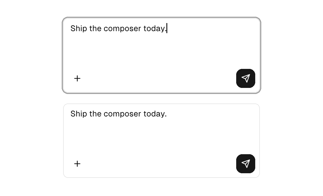
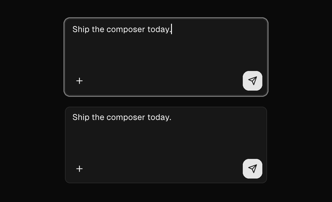
The composer shape: one bordered field wrapping a textarea plus an accessory row of controls inside the same border — attach on the bottom-left, send on the bottom-right. The group wears the focus ring whenever focus is on any control inside it, and the textarea's own chrome dissolves automatically, so the whole group reads as a single field. The textarea keeps its full behavior: text and placeholder bind from the model, on-input hears every edit, on-submit rides the primary chord, and autofocus lands the keyboard on mount.
Markup
The textarea comes first (document order is focus order), then the optional input-group-actions row. Put a spacer between the leading and trailing controls; if/else inside the row swap send for stop while a run is streaming.
<input-group label="Message composer" height="120">
  <textarea placeholder="Type a message" text="{draft}" on-input="draft_edited" on-submit="send" />
  <input-group-actions>
    <button icon="plus" variant="ghost" size="icon" on-press="attach" label="Attach"></button>
    <spacer grow="1" />
    <button icon="send" size="icon" on-press="send" label="Send"></button>
  </input-group-actions>
</input-group>
Zig builder
ui.inputGroup(.{
    .height = 120,
    .semantics = .{ .label = "Message composer" },
}, ui.el(.textarea, .{
    .placeholder = "Type a message",
    .text = model.draft,
    .on_input = Ui.inputMsg(.draft_edited),
    .on_submit = .send,
    .semantics = .{ .label = "Message" },
}, .{}), ui.inputGroupActions(.{}, .{
    ui.el(.button, .{ .icon = "plus", .variant = .ghost, .size = .icon, .on_press = .attach, .semantics = .{ .label = "Attach" } }, .{}),
    ui.spacer(1),
    ui.el(.button, .{ .icon = "send", .size = .icon, .on_press = .send, .semantics = .{ .label = "Send" } }, .{}),
}))
Attributes
| Attribute | Description |
|---|---|
label | Accessible name; the group announces as ONE named field (role group) while the entry and accessory controls stay individually reachable. |
width | Definite group width (plain number); 0/omitted sizes from the entry plus the actions row. |
height | Definite group height (plain number); the entry grow-stretches to absorb it. |
min-width | Width floor (plain number) without width's definite max. |
grow | Flex grow factor. |
input-group-actions
| Attribute | Description |
|---|---|
gap | input-group-actions: spacing between the accessory controls (plain number; default 6). |