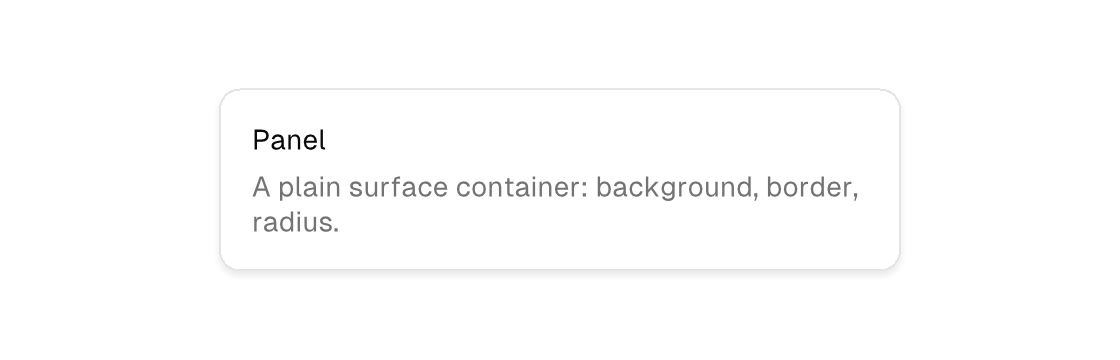
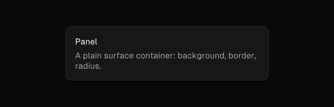
Panel
panel is the plain surface container: background, border, radius — the workhorse surface for sidebars, wells, and status areas. Like card it is a stacking container — children layer on top of each other and gap is rejected — so put a single column (or row) inside for flow. Binding on-press makes the whole surface pressable. See Native UI for how surfaces pick up color tokens.
panel
Markup
<panel width="340" padding="16">
  <column gap="6">
    <text>Build output</text>
    <text wrap="true" foreground="text_muted">Warm cache, 214 modules, 1.8s.</text>
  </column>
</panel>
Zig builder
ui.panel(.{ .width = 340, .padding = 16 }, .{
    ui.column(.{ .gap = 6 }, .{
        ui.text(.{}, "Build output"),
        ui.text(.{ .wrap = true, .style_tokens = .{ .foreground = .text_muted } }, "Warm cache, 214 modules, 1.8s."),
    }),
})
Attributes
| Attribute | Description |
|---|---|
padding | Uniform padding (plain number). |
width | Definite width (plain number): the element is exactly this wide; content neither shrinks nor overflows it. On resizable it is the initial width. |
on-press | Dispatch a Msg on press: tag or tag:{payload}. Legal on any element — a bound press handler makes it pressable, and presses on plain text/icons inside it fall through to it (dragging still selects text). |