Tabs
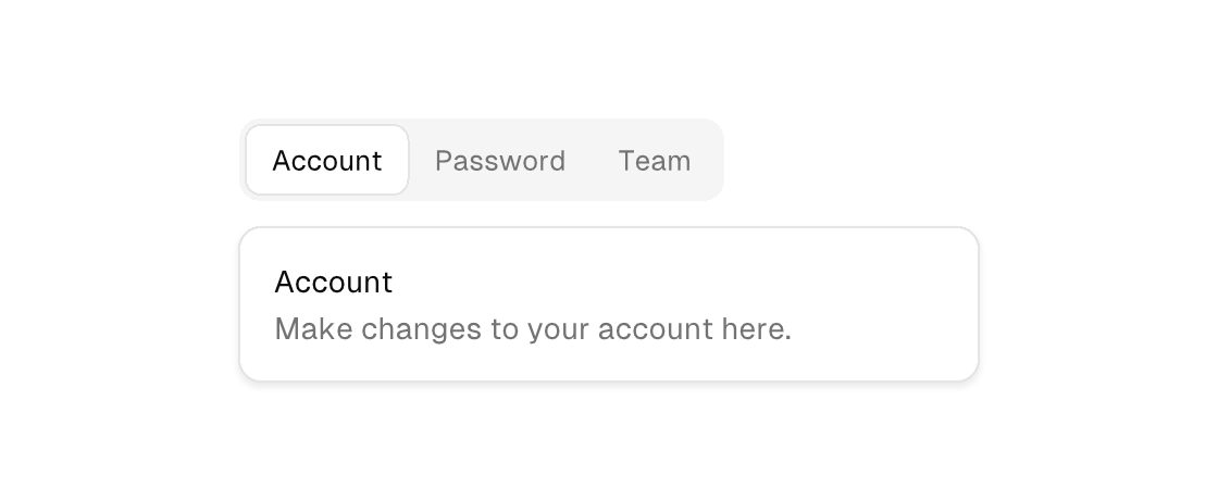
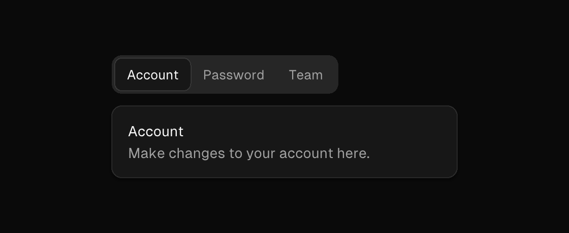
A tab strip: ONE muted rounded container (the house tab-strip treatment) whose triggers sit inside it — the active trigger lifts to the surface with a hairline, inactive triggers stay muted on the container's wash. The children are buttons whose selected state marks the active tab — usually an equality against a model field — and whose on-press switches it. The segmented-control foundation is what the engine renders tab triggers with: both markup engines lower <button> children of <tabs> to segmented_control widgets (the builder uses segmented_control children directly), so the strip renders identically however it is authored. The panel itself is ordinary conditional content: an if per tab under the strip.
Markup
<column gap="16">
  <tabs>
    <button selected="{tab == account}" on-press="show_account">Account</button>
    <button selected="{tab == password}" on-press="show_password">Password</button>
    <button selected="{tab == team}" on-press="show_team">Team</button>
  </tabs>
  <if test="{tab == account}">
    <text foreground="text_muted">Manage your account details.</text>
  </if>
</column>
Zig builder
In the builder the strip's children are segmented_control elements — the widget kind the engine's tab strips are built on (segmented controls are a documented markup exclusion, so markup composes the strip from buttons instead).
ui.el(.tabs, .{}, .{
    ui.el(.segmented_control, .{ .text = "Account", .selected = model.tab == .account, .on_press = .show_account }, .{}),
    ui.el(.segmented_control, .{ .text = "Password", .selected = model.tab == .password, .on_press = .show_password }, .{}),
    ui.el(.segmented_control, .{ .text = "Team", .selected = model.tab == .team, .on_press = .show_team }, .{}),
})
Attributes
| Attribute | Description |
|---|---|
selected | Selected state; often a {a == b} equality. |
on-press | Dispatch a Msg on press: tag or tag:{payload}. Legal on any element — a bound press handler makes it pressable, and presses on plain text/icons inside it fall through to it (dragging still selects text). |