Chart
A data chart: line, area (a line filled to the baseline), and bar series over uniform x steps, drawn through the vector path pipeline with token-driven colors — charts retheme with the palette, repaint exactly when their data changes, and report a series summary to automation and assistive tech. Series are copied into the build arena and downsampled deterministically to the per-series point budget (index-bucket min/max, spikes preserved), so a 10k-point series renders instead of erroring. Axis tick labels are opt-in and draw in the muted text register inside reserved gutters; hover-details adds a pointer-hover detail card. Presses fall through like text — with hover details on, the chart is a hover target only.
Markup
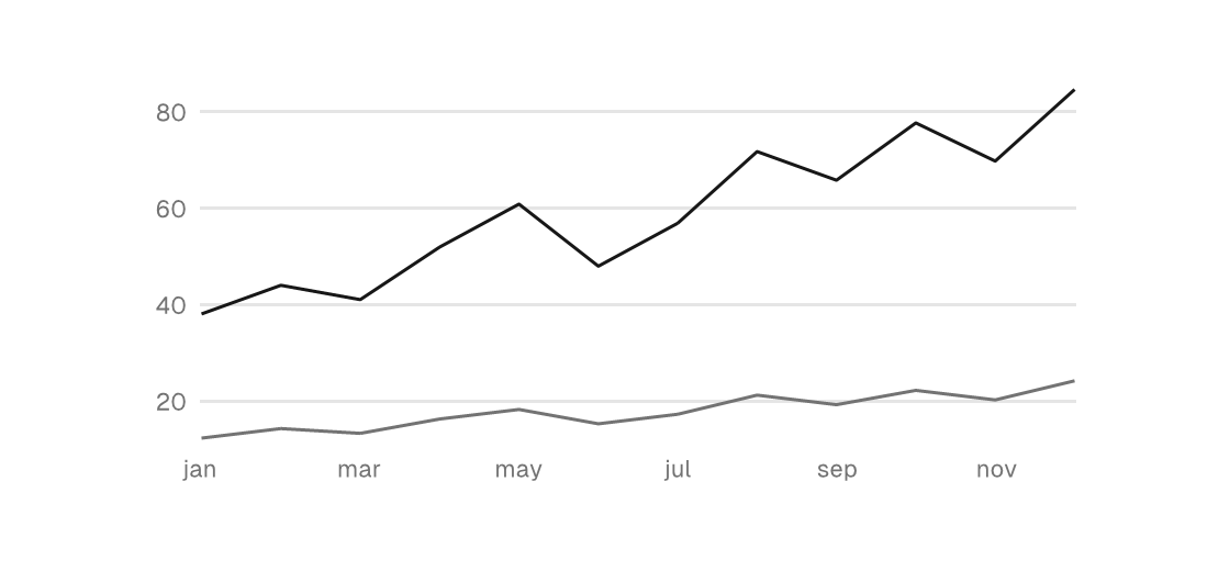
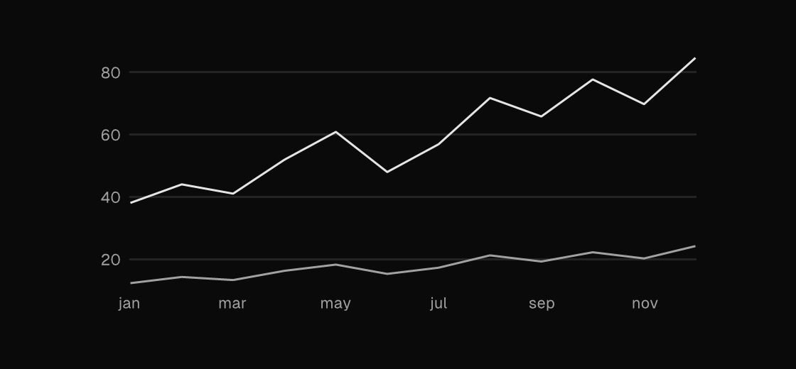
A <chart> takes one or more <series> children. Each series binds its data with values="{binding}" naming a model iterable of f32 — a field, a public declaration, or a function (arena functions work), the same sources for each accepts. Axis bounds are literals or scalar bindings. The chart above is two line series sharing one labeled frame: category labels on x, nice-step ticks on y, and gridlines riding the same tick lattice.
<chart height="180" grid-lines="3" x-labels="{months}" y-labels="true" hover-details="true" label="Request latency">
  <series kind="line" values="{p95_ms}" label="p95" />
  <series kind="line" values="{p50_ms}" color="text_muted" label="p50" />
</chart>
The series set is static — the plot's shape is part of the design, and the data varies through the bindings. NaN samples pass through and draw nothing, so a history shorter than its window enters from the right edge: pad the leading gap in a model function.
/// The 60-sample window, NaN-padded at the front while samples accumulate.
pub fn cpuSpark(model: *const Model, arena: std.mem.Allocator) []const f32 {
    const out = arena.alloc(f32, 60) catch return &.{};
    @memset(out, std.math.nan(f32));
    @memcpy(out[60 - model.cpu_len ..], model.cpuHistory());
    return out;
}
Unlabeled charts get a generated series summary (chart: line cpu 60 pts last 0.42) as their accessible name, so automation can assert on the data without pixels; label replaces it.
Bar
kind="bar" draws one column per sample. Bars always force 0 into a derived y domain — a bar's area IS its value, so the baseline is an honest zero, and baseline="true" marks it with a hairline. Category labels suit bars: one x label per column, thinned to every Nth when they would collide.
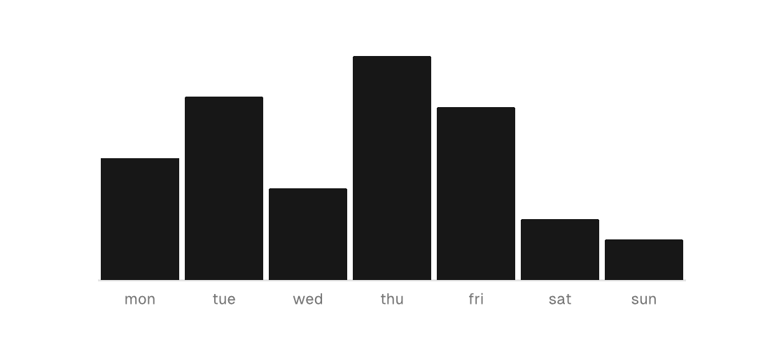
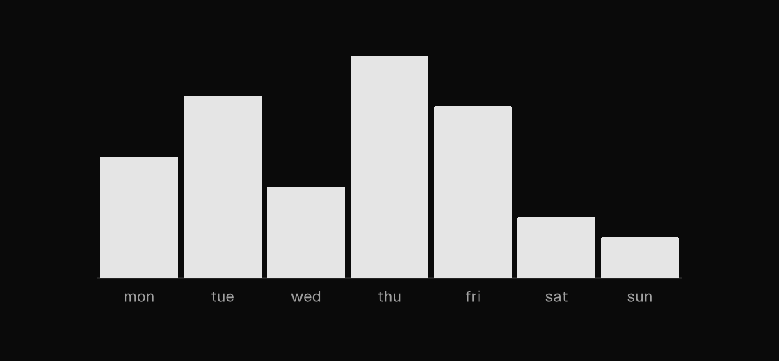
<chart height="180" baseline="true" x-labels="{weekdays}" hover-details="true" label="Builds per day">
  <series kind="bar" values="{daily_builds}" label="builds" />
</chart>
Area
kind="area" is a line filled to the baseline — the register for a quantity where the mass under the curve reads, like a rolling resource window. Explicit y-min/y-max pin the domain (here the 0..1 fraction of a fixed budget) so the fill's height stays comparable as new samples arrive instead of rescaling to the data. A rolling window has no category labels, so this one carries none — the hover card titles the hovered sample by index.
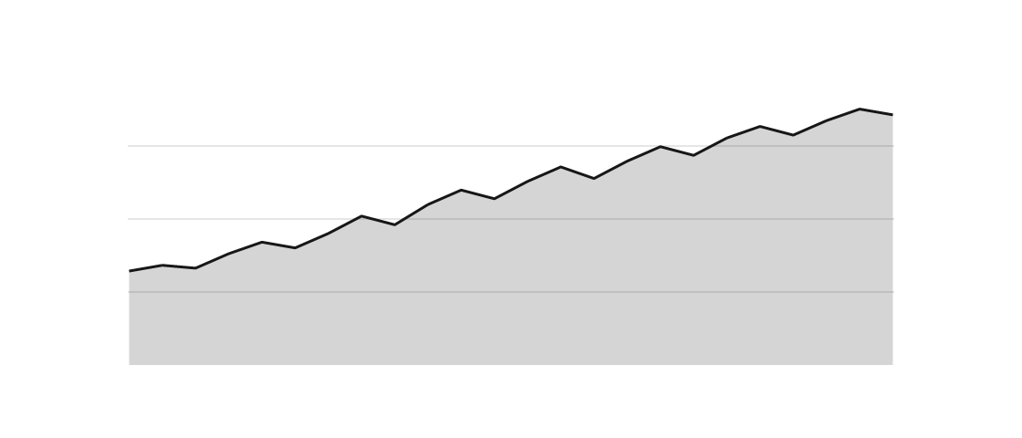
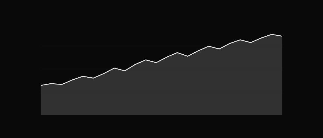
<chart height="160" y-min="0" y-max="1" grid-lines="3" hover-details="true" label="Memory">
  <series kind="area" values="{memorySpark}" label="memory" />
</chart>
Axis labels
x-labels="{binding}" names a model iterable of strings — one category label per sample, oldest first (label i names sample i). Labels draw muted below the plot and thin deterministically to every Nth so they never collide; they are dropped when a series downsamples (the bucketed indices no longer name the labeled samples). y-labels="true" adds numeric ticks in a measured gutter left of the plot: values ride a nice-step lattice (1, 2, or 5 times a power of ten), so every label is exact at its precision, and with grid-lines set the gridlines share that lattice — the grid and its labels can never disagree.
Hover details
hover-details="true" makes the plot hoverable: the pointer snaps to the nearest sample, a hairline cursor marks it (line series get a dot on the hovered point), and a floating card shows the sample's category label with every series' name and value. The card prefers the right side of the cursor and flips left at the window edge. This is interaction-only chrome — static renders never show it — and presses still fall through to whatever is around the chart. Every live preview on this page has it on: hover any of the three.
Attributes
| Attribute | Description |
|---|---|
y-min | chart: explicit y-domain floor (a number or one {binding}); omit to derive from the data. Bars always force 0 into a derived domain. |
y-max | chart: explicit y-domain ceiling (a number or one {binding}); omit to derive from the data. |
grid-lines | chart: horizontal token-hairline gridlines at even divisions (whole number; 0/omitted = none — gridlines are opt-in). |
baseline | chart: draw a hairline at the baseline (zero clamped into the domain); true/false or a {binding}. |
x-labels | chart: one {binding} naming a model iterable of strings — one category label per sample, oldest first (label i names sample i). Drawn muted below the plot, deterministically thinned to fit; dropped when a series downsamples (bucketed indices no longer name the labeled samples). |
y-labels | chart: numeric y tick labels (true/false or a {binding}). Ticks ride a nice-step lattice (1/2/5 x 10^k, exact at their precision); with grid-lines set, gridlines share the lattice so grid and labels never disagree. |
hover-details | chart: pointer-hover point details (true/false or a {binding}) — hovering snaps to the nearest sample and floats a card with its label and every series' value. Interaction-only chrome (static renders never show it); presses still fall through. |
stroke-width | chart: line stroke width override (plain number; default 1.5). |
width | Definite width (plain number); 0/omitted keeps the intrinsic sparkline-sized default (160x48). |
height | Definite height (plain number); 0/omitted keeps the intrinsic sparkline-sized default (160x48). |
grow | Flex grow factor. |
padding | Uniform padding (plain number). |
key | Sibling-scoped identity key. |
global-key | Parent-independent identity: ids survive reparenting between containers. |
label | Accessible name; omitted charts get a generated series summary ("chart: line cpu 60 pts last 0.42") so automation reads the data without pixels. |
Series
values is required on every series.
| Attribute | Description |
|---|---|
kind | series: line, area, or bar (literal; default line). Area is a line filled to the baseline; band envelopes stay with the Zig builder (ui.chart). |
values | series: one {binding} naming a []const f32 iterable (a model field, pub decl, or fn - the same sources for each accepts). Required. Pad a short history's leading gap with NaN samples - they draw nothing. |
color | series: literal color token name (a canvas ColorTokens field, e.g. accent, info, success, text_muted); default accent. Series retheme with the palette. |
label | series: name for the chart's semantics summary ("cpu", "stars"); the kind tag stands in when empty. |
Zig builder
The builder is the escape hatch for what markup deliberately excludes: .band series (a min/max envelope needs a paired lower-edge slice per point) and series sets composed dynamically at view time. ui.chart takes ChartOptions and a slice of canvas.ChartSeries (kinds .line, .bar, .band; fill shades the area under a line — markup's kind="area").
ui.chart(.{
    .width = 420,
    .height = 180,
    .grid_lines = 3,
    .baseline = true,
    .x_labels = &month_labels,
    .y_labels = true,
    .hover_details = true,
}, &.{
    .{ .kind = .line, .fill = true, .label = "cpu", .values = model.cpu_samples },
    .{ .kind = .bar, .color = .text_muted, .label = "jobs", .values = model.job_counts },
})
Options
ChartOptions fields (the builder-side equivalent of the attributes table):
| Option | Description |
|---|---|
width | Definite plot width (same contract as ElementOptions.width); 0 keeps the intrinsic sparkline-sized default (160x48). |
height | Definite plot height (same contract as ElementOptions.height); 0 keeps the intrinsic sparkline-sized default. |
grow | Flex grow factor; flexes the plot instead of a definite size. |
padding | Uniform padding (plain number). |
y_min | Explicit y-domain minimum; null derives it from the data (bar series force 0 into a derived domain — bars always have an honest zero baseline). |
y_max | Explicit y-domain maximum; null derives it from the data. |
grid_lines | Horizontal token-hairline gridlines (0 = none; gridlines are opt-in, never default). At even divisions of the plot — or on the y-label tick lattice when y_labels is on, so grid and labels share positions. |
baseline | Hairline at the baseline (zero clamped into the domain). |
x_labels | Category labels for the x axis, one per sample index (empty = no x axis). Muted, in a reserved gutter, thinned to fit; dropped when a series downsamples. |
y_labels | Numeric y tick labels on the nice-step lattice, in a measured gutter left of the plot. |
hover_details | Pointer-hover point details: snap cursor, per-point dots on line series, and a floating card with the sample's label and every series' value. Interaction-only; presses still fall through. |
stroke_width | Line stroke width override (default 1.5). |
key / global_key | Widget identity, as on any element. |
semantics | Widget semantics; the role defaults to chart, an empty label gets a generated series summary, and the accessibility value reports the first series' latest point. |