Badge
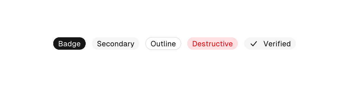
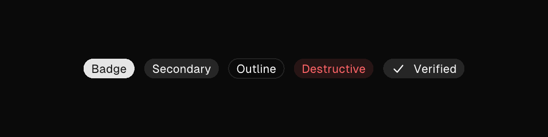
A text leaf for counts and statuses: the content is the label (with {} interpolation), variant picks the color treatment, and an optional icon draws a built-in vector icon inline before the text. Badges are not interactive — for a pressable chip see toggle-button or button.
badge
Markup
<row gap="10" cross="center">
  <badge>Badge</badge>
  <badge variant="secondary">Secondary</badge>
  <badge variant="outline">Outline</badge>
  <badge variant="destructive">Destructive</badge>
  <badge variant="secondary" icon="check">Verified</badge>
</row>
Zig builder
ui.row(.{ .gap = 10, .cross = .center }, .{
    ui.el(.badge, .{ .text = "Badge" }, .{}),
    ui.el(.badge, .{ .text = "Secondary", .variant = .secondary }, .{}),
    ui.el(.badge, .{ .text = "Outline", .variant = .outline }, .{}),
    ui.el(.badge, .{ .text = "Destructive", .variant = .destructive }, .{}),
    ui.el(.badge, .{ .text = "Verified", .variant = .secondary, .icon = "check" }, .{}),
})
Attributes
| Attribute | Description |
|---|---|
text | Text value for text-bearing elements; a literal or one {binding}. |
variant | Visual variant: default|primary|secondary|outline|ghost|destructive. |
icon | button, toggle-button, list-item, menu-item: vector icon drawn inline (buttons/toggle-buttons before the label, list/menu items as a leading slot): a built-in name (comptime-validated against canvas.icons.known_icon_names, e.g. save, plus, refresh-cw), an app-registered app:<name>, or one {binding} resolving to such a name. Icon-only buttons when the content is empty — add a label. One hit target, one enabled/disabled tint. |