Alert
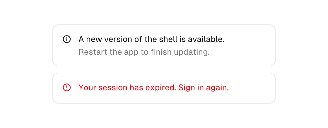
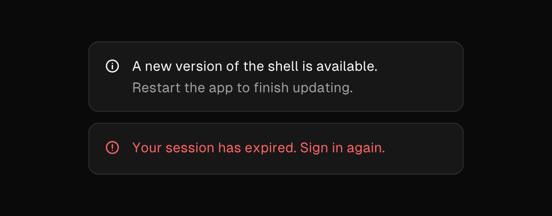
An inline callout surface. The title comes from the text attribute and renders beside a fixed 16px icon aligned to its first line; variant colors the identity (destructive reads in the destructive hue with a warning icon). Children are the description: they start under the title and hang past the icon column, the standard callout grid. Like the other stacking surfaces it rejects gap — wrap multi-line descriptions in a column.
alert
Markup
<column gap="12" width="380">
  <alert text="A new version of the shell is available.">
    <text wrap="true" foreground="text_muted">Restart the app to finish updating.</text>
  </alert>
  <alert text="Your session has expired. Sign in again." variant="destructive"></alert>
</column>
Zig builder
ui.column(.{ .gap = 12, .width = 380 }, .{
    ui.el(.alert, .{ .text = "A new version of the shell is available." }, .{
        ui.text(.{ .wrap = true, .style_tokens = .{ .foreground = .text_muted } }, "Restart the app to finish updating."),
    }),
    ui.el(.alert, .{ .text = "Your session has expired. Sign in again.", .variant = .destructive }, .{}),
})
For a message the user can dismiss, render the alert under an if and clear the flag from a button inside it — the model owns the visibility, as with every surface. For modal interruptions reach for dialog, drawer, or sheet instead.
Attributes
| Attribute | Description |
|---|---|
text | Text value for text-bearing elements; a literal or one {binding}. |
variant | Visual variant: default|primary|secondary|outline|ghost|destructive. |