Button
A text-bearing press control. The label is the element's content, on-press dispatches its Msg, and an inline icon draws before the label as part of the same hit target. Six variants cover the house palette; previews are rendered by the engine itself.
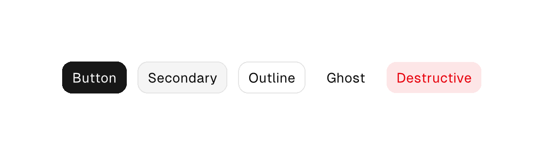
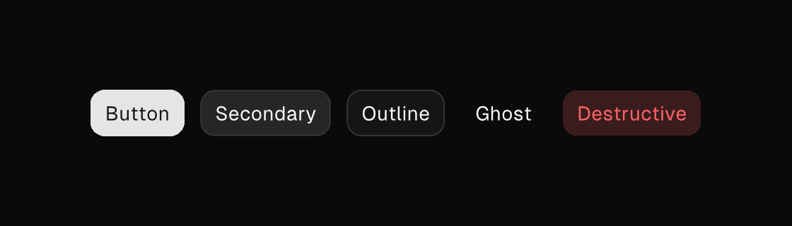
Markup
<row gap="12" cross="center">
  <button variant="primary" on-press="save">Save</button>
  <button variant="secondary" on-press="duplicate">Duplicate</button>
  <button variant="outline" on-press="preview">Preview</button>
  <button variant="ghost" on-press="dismiss">Dismiss</button>
  <button variant="destructive" on-press="delete_note">Delete</button>
</row>
Zig builder
ui.row(.{ .gap = 12, .cross = .center }, .{
    ui.button(.{ .variant = .primary, .on_press = .save }, "Save"),
    ui.button(.{ .variant = .secondary, .on_press = .duplicate }, "Duplicate"),
    ui.button(.{ .variant = .outline, .on_press = .preview }, "Preview"),
    ui.button(.{ .variant = .ghost, .on_press = .dismiss }, "Dismiss"),
    ui.button(.{ .variant = .destructive, .on_press = .delete_note }, "Delete"),
})
Sizes
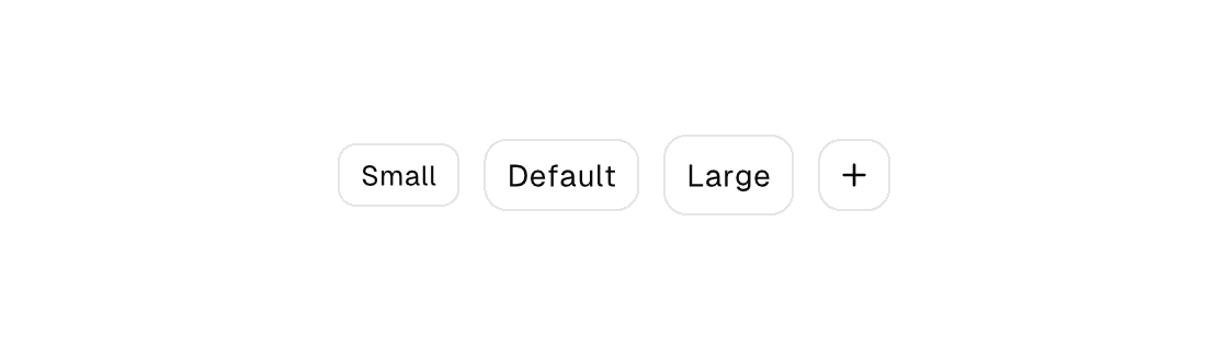
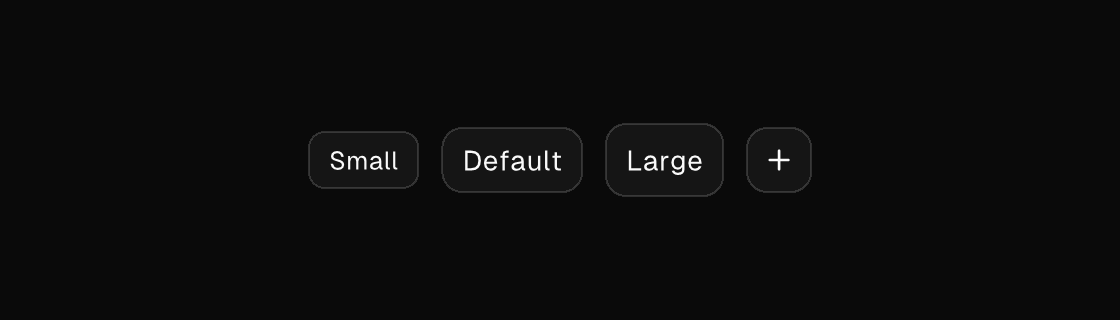
Four sizes: sm, default, lg, and icon — the icon size renders a square, icon-only button (give it a label for accessibility).
<row gap="12" cross="center">
  <button size="sm" variant="outline" on-press="zoom_out">Small</button>
  <button variant="outline" on-press="reset_zoom">Default</button>
  <button size="lg" variant="outline" on-press="zoom_in">Large</button>
  <button size="icon" icon="plus" label="New note" on-press="create_note"></button>
</row>
Icons
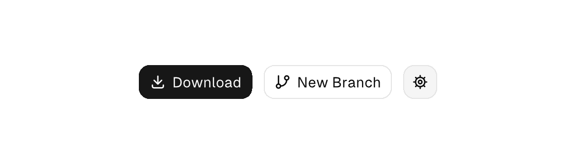
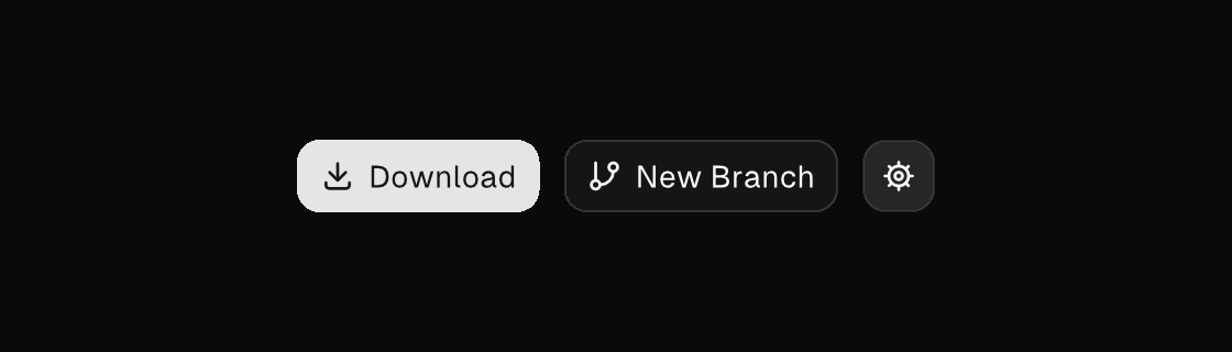
icon names a built-in vector icon (see the icon registry) drawn inline before the label — one hit target, one enabled/disabled tint.
<row gap="12" cross="center">
  <button variant="primary" icon="download" on-press="download">Download</button>
  <button variant="outline" icon="git-branch" on-press="new_branch">New Branch</button>
  <button disabled="{saving}" on-press="save">Save</button>
</row>
States
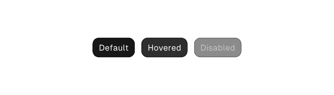
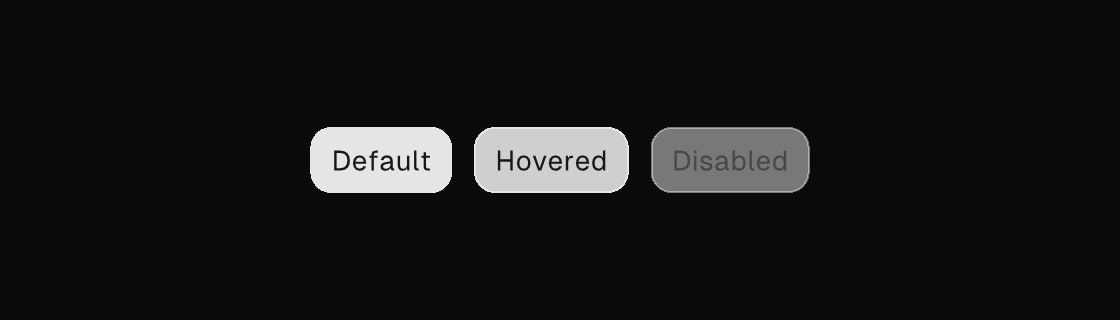
Hover and press styling is engine-owned render state; disabled is a source attribute (a literal or a model binding).
Button Group
button-group attaches related action buttons into one segmented bar — flush segments, one shared corner language, one interior seam. It has its own page.
Attributes
| Attribute | Description |
|---|---|
text | Text value for text-bearing elements; a literal or one {binding}. |
variant | Visual variant: default|primary|secondary|outline|ghost|destructive. |
size | Control size: default|sm|lg|icon. On text, also the typography rungs heading|display (themable token steps above title - a section heading, a hero stat); numeric sizes are not accepted - retheme the typography tokens instead. |
icon | button, toggle-button, list-item, menu-item: vector icon drawn inline (buttons/toggle-buttons before the label, list/menu items as a leading slot): a built-in name (comptime-validated against canvas.icons.known_icon_names, e.g. save, plus, refresh-cw), an app-registered app:<name>, or one {binding} resolving to such a name. Icon-only buttons when the content is empty — add a label. One hit target, one enabled/disabled tint. |
disabled | Disables the control; true/false or a {binding}. |
selected | Selected state; often a {a == b} equality. |
autofocus | Focusable controls only: moves keyboard focus to the element when it mounts or when the value turns on (edge-triggered - holding it true never re-steals focus). The TEA way to focus an editor on create. |
label | Accessible name; when set it REPLACES the element's text as the announced name - screen readers and automation snapshots see the label, never the text it shadows. |
on-press | Dispatch a Msg on press: tag or tag:{payload}. Legal on any element — a bound press handler makes it pressable, and presses on plain text/icons inside it fall through to it (dragging still selects text). |
on-hold | Press-and-hold Msg: a pointer held ~350 ms dispatches it and the release then presses nothing; a quick click dispatches on-press as usual. A right/ctrl-click with no context menu on the route dispatches it immediately. Like on-press, binding it makes any element pressable. |