Tree
A disclosure-tree container. The rows are ordinary elements (usually list items) carrying role="treeitem", and every such descendant joins one roving keyboard focus set: Up/Down walk the visible rows, Left collapses a row or moves to its parent, Right expands or moves to the first child, Home/End jump to the edges. Expandable rows bind expanded and dispatch on-toggle; selection follows each row's on-press. The model owns both states — children of a collapsed row are simply not rendered.
tree
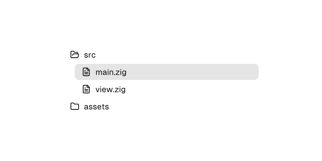
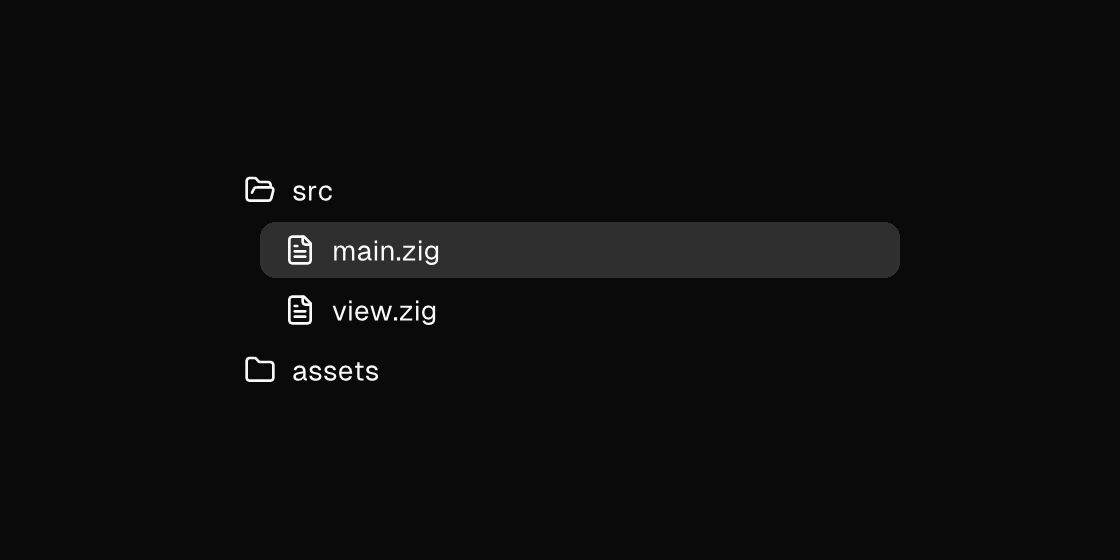
Markup
<tree width="340" gap="2">
  <list-item icon="folder-open" role="treeitem" expanded="{src_open}" on-toggle="toggle_src" on-press="select_src">src</list-item>
  <if test="{src_open}">
    <row>
      <column width="20" />
      <column gap="2" grow="1">
        <list-item icon="file-text" role="treeitem" selected="{file == main}" on-press="select_main">main.zig</list-item>
        <list-item icon="file-text" role="treeitem" selected="{file == view}" on-press="select_view">view.zig</list-item>
      </column>
    </row>
  </if>
  <list-item icon="folder" role="treeitem" expanded="{assets_open}" on-toggle="toggle_assets" on-press="select_assets">assets</list-item>
</tree>
The indent is plain layout — a fixed-width spacer column beside the children. Omit expanded on leaf rows; only rows that bind it participate in Left/Right disclosure.
Zig builder
ui.tree(.{ .width = 340, .gap = 2 }, .{
    ui.listItem(.{
        .icon = "folder-open",
        .expanded = model.src_open,
        .on_toggle = .toggle_src,
        .on_press = .select_src,
        .semantics = .{ .role = .treeitem },
    }, "src"),
    if (model.src_open) ui.row(.{}, .{
        ui.column(.{ .width = 20 }, .{}),
        ui.column(.{ .gap = 2, .grow = 1 }, .{
            ui.listItem(.{ .icon = "file-text", .selected = model.file == .main, .on_press = .select_main, .semantics = .{ .role = .treeitem } }, "main.zig"),
            ui.listItem(.{ .icon = "file-text", .selected = model.file == .view, .on_press = .select_view, .semantics = .{ .role = .treeitem } }, "view.zig"),
        }),
    }) else ui.stack(.{}, .{}),
    ui.listItem(.{
        .icon = "folder",
        .expanded = model.assets_open,
        .on_toggle = .toggle_assets,
        .on_press = .select_assets,
        .semantics = .{ .role = .treeitem },
    }, "assets"),
})
Attributes
| Attribute | Description |
|---|---|
role | Accessibility role (listitem, treeitem, button, ...). treeitem also makes the row part of its tree's roving keyboard focus set. |
expanded | Tree rows (role="treeitem"): disclosure state (true/false or a {binding}). Omit on leaves; expanded rows collapse on Left, collapsed ones expand on Right, both through on-toggle - the model owns the state. |
selected | Selected state; often a {a == b} equality. |
on-toggle | Dispatch a Msg on toggle: tag or tag:{payload}. Hit-target elements only (checkbox, toggle, toggle-button, switch, accordion, ...). |
on-press | Dispatch a Msg on press: tag or tag:{payload}. Legal on any element — a bound press handler makes it pressable, and presses on plain text/icons inside it fall through to it (dragging still selects text). |
gap | Spacing between children (plain number). Rejected on stacking containers (stack, panel, card, the modal surfaces) — they layer children; put a column (or row) inside for flow. |
label | Accessible name; when set it REPLACES the element's text as the announced name - screen readers and automation snapshots see the label, never the text it shadows. |