Timeline
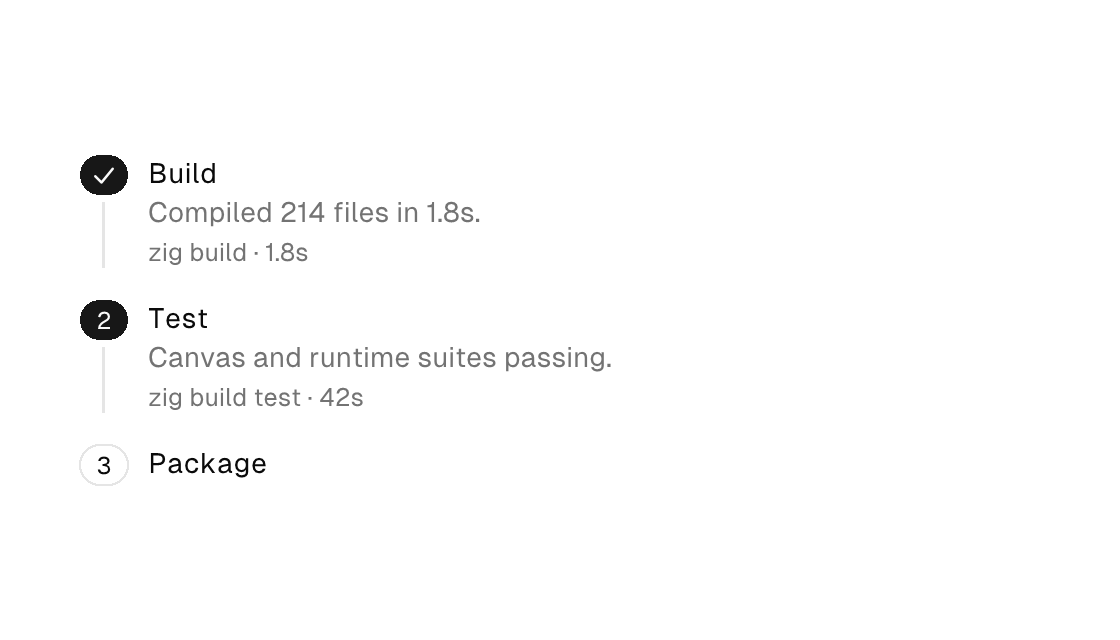
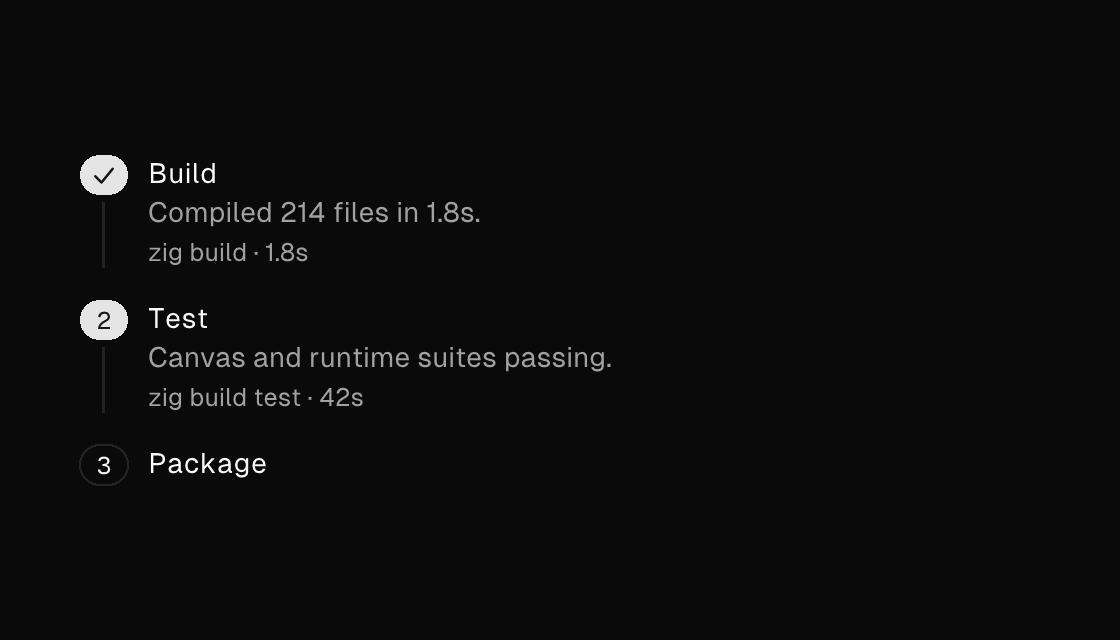
A timeline/ledger list container: a vertical column of timeline-item children (for and if work inside it). Each item pairs a leading indicator badge — indicator text or a small dot, colored by variant — with a title/description/meta content column, joined by a connector rail; set connector="false" on the last item to end the rail. Binding on-press makes the whole item pressable with a trailing chevron. For a horizontal stage indicator, see stepper.
Markup
<timeline gap="0">
  <timeline-item indicator="1" variant="primary" title="Build" description="Compiled 214 files in 1.8s." meta="zig build · 1.8s"></timeline-item>
  <timeline-item indicator="2" title="Test" description="Canvas and runtime suites passing." meta="zig build test · 42s" on-press="open_test_log"></timeline-item>
  <timeline-item indicator="3" title="Package" connector="false"></timeline-item>
</timeline>
Zig builder
The builder additionally takes an icon option that draws a registry icon inside the indicator badge (a vector check for finished steps).
ui.timeline(.{}, .{
    ui.timelineItem(.{ .icon = "check", .variant = .primary, .title = "Build", .description = "Compiled 214 files in 1.8s.", .meta = "zig build · 1.8s" }),
    ui.timelineItem(.{ .indicator = "2", .title = "Test", .description = "Canvas and runtime suites passing.", .meta = "zig build test · 42s", .on_press = .open_test_log }),
    ui.timelineItem(.{ .indicator = "3", .title = "Package", .connector = false }),
})
Eject
When theming is not enough and you need to own the timeline’s shape, eject it: the canonical source lands in your project as your code — SDK updates never touch it, and ejecting twice errors instead of overwriting your edits. timeline ejects as a markup template (src/components/timeline.native); timeline-item ejects as a Zig view function (src/components/timeline_item.zig).
native eject component timeline
native eject component timeline-item
The ownership model and what to do after ejecting are in Use, eject, or build.
Attributes
| Attribute | Description |
|---|---|
gap | Spacing between items (plain number). |
grow | Flex grow factor. |
key | Sibling-scoped identity key. |
global-key | Parent-independent identity: ids survive reparenting between containers. |
label | Accessible name; when set it REPLACES the element's text as the announced name - screen readers and automation snapshots see the label, never the text it shadows. |
Items
title is required on every item.
| Attribute | Description |
|---|---|
title | timeline-item: bold first line (a literal or one {binding}). Required. |
description | timeline-item: wrapped muted preview under the title (a literal or one {binding}). |
meta | timeline-item: muted trailing meta line, e.g. "claude · sonnet · 1m 12s" (a literal or one {binding}). |
indicator | timeline-item: leading badge text ("✓", a number); empty renders a small dot. |
variant | timeline-item: indicator color variant (default|primary|secondary|outline|ghost|destructive) - map run outcomes here. |
connector | timeline-item: false ends the connector rail (set on the last item). |
selected | timeline-item: selected state (true/false or a {binding}). |
on-press | timeline-item: Msg dispatched from anywhere on the item (tag or tag:{payload}); adds a trailing chevron. |