Table
A vertical table container: children are table-row elements, and each row's children are table-cell text leaves. Cells only live in rows and rows only live in tables — the validator enforces the nesting. Column sizing is flex: give each cell a grow factor and the columns line up across rows. The chrome is engine-owned: hairline separators under every row but the last (no outer box, no cell gridlines), a full-width hover wash on rows, and selected highlights a row. Style the header row's cells muted and small, right-align numeric columns with text-alignment="end", and cells dispatch on-press.
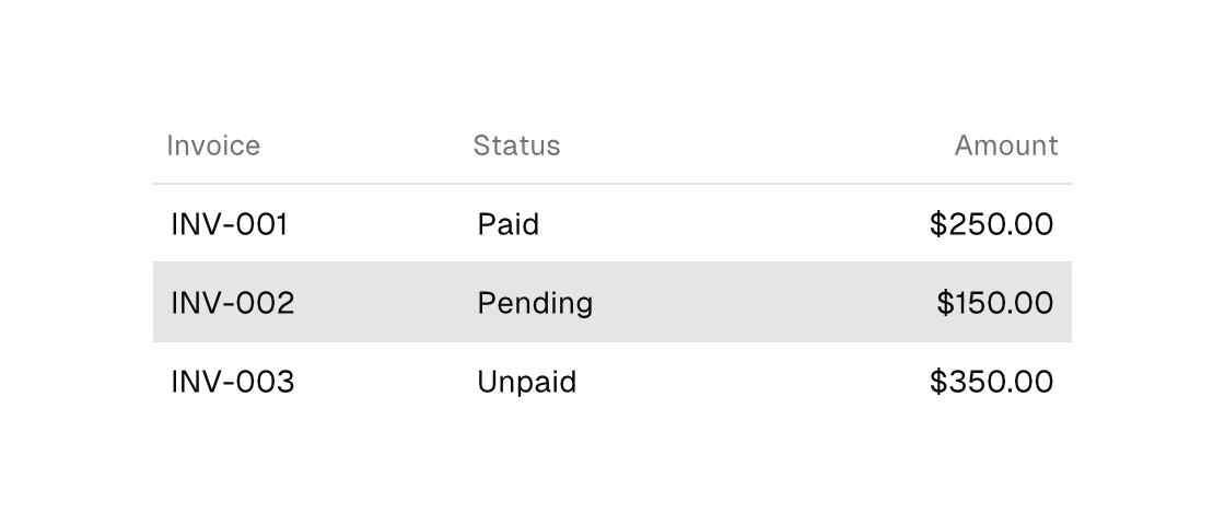
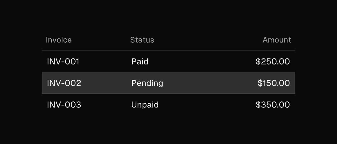
Markup
<table width="420">
  <table-row>
    <table-cell grow="1" size="sm" foreground="text_muted">Invoice</table-cell>
    <table-cell grow="1" size="sm" foreground="text_muted">Status</table-cell>
    <table-cell grow="1" size="sm" foreground="text_muted" text-alignment="end">Amount</table-cell>
  </table-row>
  <for each="invoices" as="invoice" key="id">
    <table-row selected="{invoice.id == selected_invoice}">
      <table-cell grow="1" on-press="open_invoice:{invoice.id}">{invoice.number}</table-cell>
      <table-cell grow="1">{invoice.status}</table-cell>
      <table-cell grow="1" text-alignment="end">{invoice.amount}</table-cell>
    </table-row>
  </for>
</table>
Zig builder
The builder names differ from the markup: rows are .data_row and cells are .data_cell (the underlying widget kinds).
ui.el(.table, .{ .width = 420 }, .{
    ui.el(.data_row, .{}, .{
        ui.el(.data_cell, .{ .text = "Invoice", .grow = 1, .size = .sm, .style_tokens = .{ .foreground = .text_muted } }, .{}),
        ui.el(.data_cell, .{ .text = "Status", .grow = 1, .size = .sm, .style_tokens = .{ .foreground = .text_muted } }, .{}),
        ui.el(.data_cell, .{ .text = "Amount", .grow = 1, .size = .sm, .text_alignment = .end, .style_tokens = .{ .foreground = .text_muted } }, .{}),
    }),
    ui.el(.data_row, .{}, .{
        ui.el(.data_cell, .{ .text = "INV-001", .grow = 1, .on_press = .{ .open_invoice = 1 } }, .{}),
        ui.el(.data_cell, .{ .text = "Paid", .grow = 1 }, .{}),
        ui.el(.data_cell, .{ .text = "$250.00", .grow = 1, .text_alignment = .end }, .{}),
    }),
    ui.el(.data_row, .{ .selected = true }, .{
        ui.el(.data_cell, .{ .text = "INV-002", .grow = 1, .on_press = .{ .open_invoice = 2 } }, .{}),
        ui.el(.data_cell, .{ .text = "Pending", .grow = 1 }, .{}),
        ui.el(.data_cell, .{ .text = "$150.00", .grow = 1, .text_alignment = .end }, .{}),
    }),
})
For icon rows and single-column data prefer list; tables earn their keep once columns need to align.
Attributes
| Attribute | Description |
|---|---|
grow | Flex grow factor; give spacer one. |
selected | Selected state; often a {a == b} equality. |
text-alignment | Horizontal alignment of text content: start|center|end. Consumed by text (plain and wrapped), status-bar, and surface titles; controls that own their label placement (button, badge) ignore it. On a bubble's reactions child it names the pill's dock (end is the default trailing dock). |
on-press | Dispatch a Msg on press: tag or tag:{payload}. Legal on any element — a bound press handler makes it pressable, and presses on plain text/icons inside it fall through to it (dragging still selects text). |