Dropdown Menu
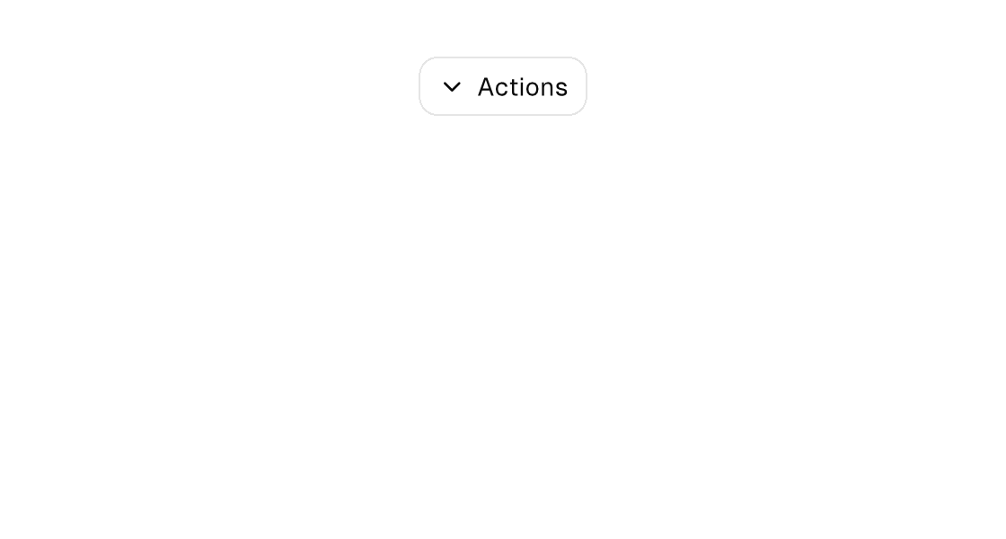
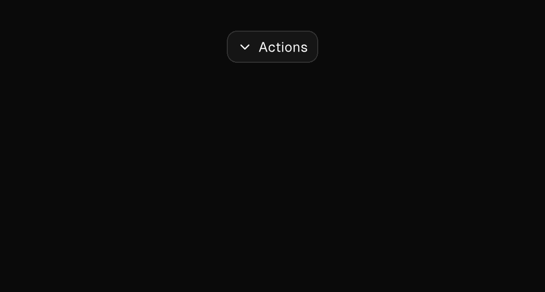
A vertical menu surface whose children are menu-item elements. Setting anchor="below" (or above) floats the surface against its parent's frame instead of the flow: it paints in a late z-pass above the whole tree, is clipped only by the window (never by a scroll pane), and auto-flips to the other side when it does not fit. The sanctioned shape is a stack that wraps the trigger and, under an if, the anchored dropdown as its sibling — the model owns the open flag, and on-dismiss closes it on Escape or a click outside.
Markup
<stack>
  <button variant="outline" icon="chevron-down" on-press="toggle_actions">Actions</button>
  <if test="{actions_open}">
    <dropdown-menu anchor="below" min-width="200" on-dismiss="close_actions">
      <menu-item text="Duplicate" icon="copy" on-press="duplicate_note" />
      <menu-item text="Rename" icon="edit" on-press="rename_note" />
      <menu-item text="Download" icon="download" on-press="download_note" />
      <separator />
      <menu-item text="Delete" icon="trash" on-press="delete_note" />
    </dropdown-menu>
  </if>
</stack>
Handle the item's Msg in update and clear the open flag there — a menu press does not dismiss implicitly. Select and combobox build their option lists from exactly this pattern (with anchor-alignment="stretch" for the select-menu width).
Zig builder
ui.stack(.{}, .{
    ui.button(.{ .variant = .outline, .icon = "chevron-down", .on_press = .toggle_actions }, "Actions"),
    if (model.actions_open) ui.el(.dropdown_menu, .{
        .anchor = .below,
        .min_width = 200,
        .on_dismiss = .close_actions,
    }, .{
        ui.el(.menu_item, .{ .text = "Duplicate", .icon = "copy", .on_press = .duplicate_note }, .{}),
        ui.el(.menu_item, .{ .text = "Rename", .icon = "edit", .on_press = .rename_note }, .{}),
        ui.el(.menu_item, .{ .text = "Download", .icon = "download", .on_press = .download_note }, .{}),
        ui.separator(.{}),
        ui.el(.menu_item, .{ .text = "Delete", .icon = "trash", .on_press = .delete_note }, .{}),
    }) else ui.stack(.{}, .{}),
})
Static menu surface
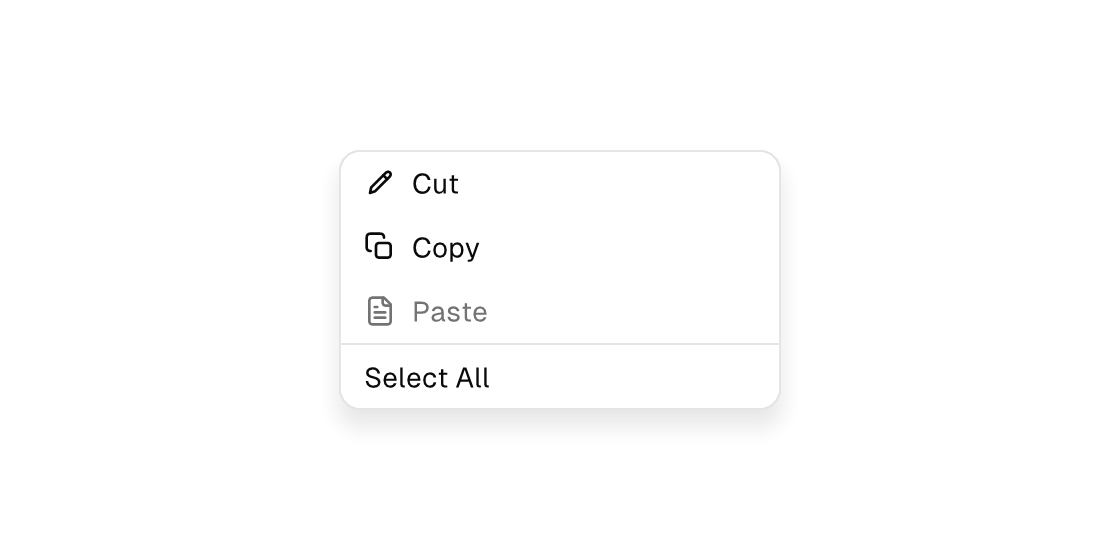
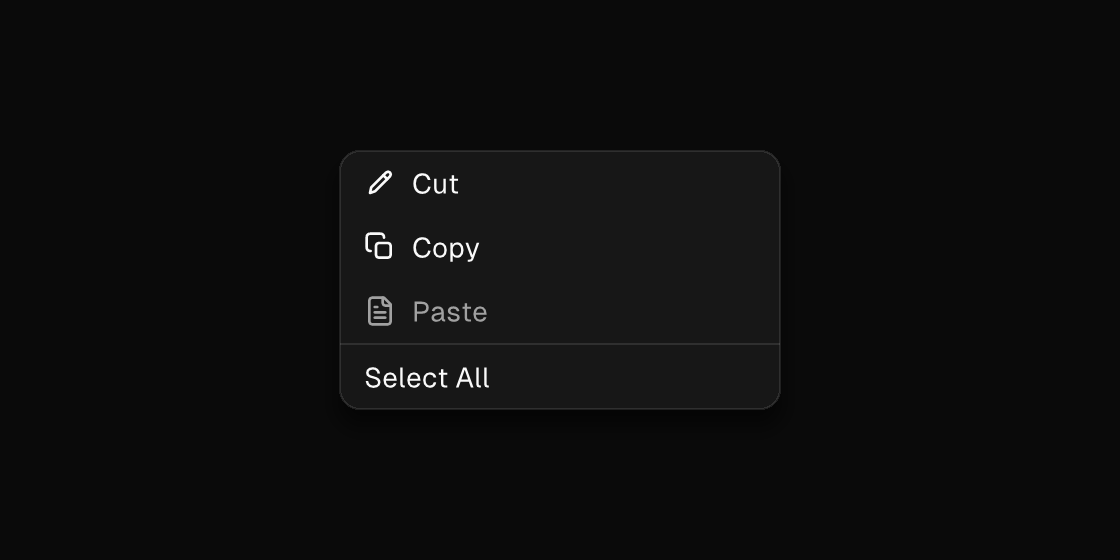
The builder also has menu_surface, an in-flow (non-floating) menu panel with the same menu_item children — useful for command palettes and always-visible menus. It is a documented markup exclusion: write it as a Zig view.
ui.el(.menu_surface, .{ .min_width = 220 }, .{
    ui.el(.menu_item, .{ .text = "Cut", .icon = "edit", .on_press = .cut_selection }, .{}),
    ui.el(.menu_item, .{ .text = "Copy", .icon = "copy", .on_press = .copy_selection }, .{}),
    ui.el(.menu_item, .{ .text = "Paste", .icon = "file-text", .disabled = true }, .{}),
    ui.separator(.{}),
    ui.el(.menu_item, .{ .text = "Select All", .on_press = .select_all }, .{}),
})
Right-click context menus are a separate channel with its own element: a <context-menu> child on a pressable element (or ElementOptions.context_menu in Zig views) presents the platform's native menu — macOS NSMenu — and falls back to an anchored surface on hosts without one; selections dispatch typed Msgs. The anchored dropdown-menu here is for app-designed surfaces you open yourself (pickers, button dropdowns, hold-reveal menus) — see Menus.
Attributes
Dropdown-menu:
| Attribute | Description |
|---|---|
anchor | dropdown-menu: floats the surface against its PARENT's frame instead of the flow (literal below or above; either side auto-flips at the window edges). Late z-pass above the whole tree, window-clipped — never cropped by a scroll pane, never reflows siblings. Put the dropdown beside its trigger inside a stack. |
anchor-alignment | dropdown-menu (with anchor): horizontal alignment against the anchor - start, end, or stretch (stretch also widens the surface to at least the anchor's width, the select-menu look). |
anchor-offset | dropdown-menu (with anchor): literal gap in points between the anchor edge and the surface (default 4). |
on-dismiss | Dismissible surfaces only (dialog, drawer, sheet, dropdown-menu): Msg dispatched when Escape or a click outside dismisses the surface, so the MODEL owns the close (clear the open flag in update). The engine hides the surface immediately as an optimistic echo; the source tree wins on the next rebuild. |
min-width | Width floor (plain number) without width's definite max: the element may grow past it but never shrink below. On split panes it bounds the divider drag. |
Menu-item:
| Attribute | Description |
|---|---|
text | Text value for text-bearing elements; a literal or one {binding}. |
icon | button, toggle-button, list-item, menu-item: vector icon drawn inline (buttons/toggle-buttons before the label, list/menu items as a leading slot): a built-in name (comptime-validated against canvas.icons.known_icon_names, e.g. save, plus, refresh-cw), an app-registered app:<name>, or one {binding} resolving to such a name. Icon-only buttons when the content is empty — add a label. One hit target, one enabled/disabled tint. |
disabled | Disables the control; true/false or a {binding}. |
on-press | Dispatch a Msg on press: tag or tag:{payload}. Legal on any element — a bound press handler makes it pressable, and presses on plain text/icons inside it fall through to it (dragging still selects text). |