Bubble
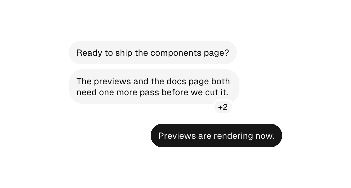
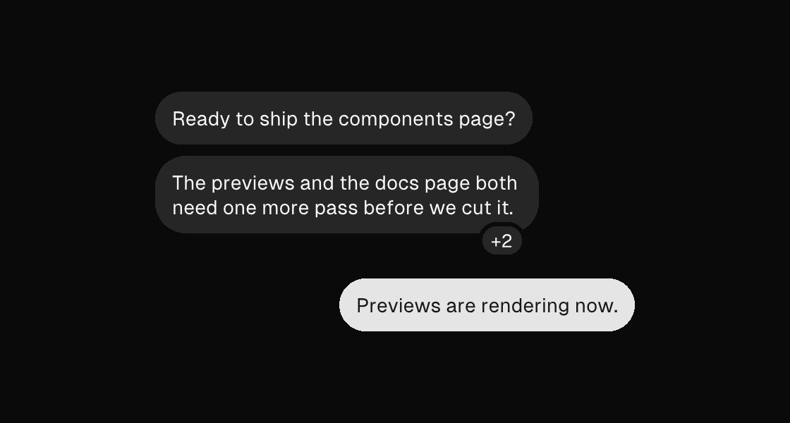
bubble is the chat-message surface: a capsule-cornered fill that hugs its message (10px vertical, 12px horizontal — one body line reads as a full pill). Children stack inside, and variant picks the side of the conversation: the default muted wash is the received side, primary is the sent side — its fill re-inks the text inside automatically, so you never hand-pick knockout ink per message. outline, destructive, and ghost round out the register. Like every stacking surface it rejects gap; override the built-in hug with padding if you must.
A bubble never spans its thread: with no explicit width it hugs its message up to 80% of the container's width, then the message wraps — one long paragraph reads as a column, not a wall. ghost is exempt (its content carries the message full-width), and an explicit width always wins. Because bubbles hug, a bubble placed directly in a column sits on the leading edge like a received message; give the column cross="end" for the sent side.
Grouped runs
Consecutive messages from the same sender read as a group, and grouping is spacing, not vocabulary: the reference keeps full capsule corners on every bubble in a run, so there is no group container to reach for. Use the measured rhythm — 8px between bubbles within a run, 32px between turns — with plain columns:
<column gap="32" width="340">
  <column gap="8">
    <bubble>
      <text wrap="true">Ready to ship the components page?</text>
    </bubble>
    <bubble>
      <text wrap="true">The previews and the docs page both need one more pass before we cut it.</text>
      <reactions>+2</reactions>
    </bubble>
  </column>
  <column gap="8" cross="end">
    <bubble variant="primary">
      <text wrap="true">Previews are rendering now.</text>
    </bubble>
  </column>
</column>
Reactions
A reactions child docks the reaction pill: one small muted capsule straddling the bubble's bottom edge — a quarter overlapping the capsule, three quarters hanging below, separated from the fill by a ring in the page background. The pill holds one run of text ({bindings} work) and docks per text-alignment: end is the default trailing corner, start and center are the alternatives. It draws on the page plane, so a primary bubble's knockout ink never applies to it.
The pill consumes no layout space — like the reference, it overlaps whatever sits below, which is exactly why the 32px turn gap matters: it is the overlap's breathing room. One pill per bubble; it is chrome, not content, so events, keys, and layout stay on the bubble. Literal pill text rides the same font-coverage guard as every rendered label — emoji outside the bundled face are a teaching error (bind them from model data for live apps, where the platform text stack renders them; the reference/screenshot path cannot).
Zig builder
The pill rides the bubble's chrome-text channels directly (the same convention alert titles use): text is the run, text_alignment the dock. Note the builder's text_alignment default is .start; markup's <reactions> defaults to the reference's trailing dock, so set .end explicitly here.
ui.column(.{ .gap = 32, .width = 340 }, .{
    ui.column(.{ .gap = 8 }, .{
        ui.el(.bubble, .{}, .{
            ui.text(.{ .wrap = true }, "Ready to ship the components page?"),
        }),
        ui.el(.bubble, .{ .text = "+2", .text_alignment = .end }, .{
            ui.text(.{ .wrap = true }, "The previews and the docs page both need one more pass before we cut it."),
        }),
    }),
    ui.column(.{ .gap = 8, .cross = .end }, .{
        ui.el(.bubble, .{ .variant = .primary }, .{
            ui.text(.{ .wrap = true }, "Previews are rendering now."),
        }),
    }),
})
Attributes
| Attribute | Description |
|---|---|
padding | Uniform padding (plain number). |
variant | Visual variant: default|primary|secondary|outline|ghost|destructive. |
On the reactions child:
| Attribute | Description |
|---|---|
text-alignment | reactions: where the pill docks along the bubble's bottom edge — start, center, or end (the default trailing dock). A literal name: the dock is a static design choice, like anchor placement. |