Icon
A vector icon leaf: name selects the icon, tint comes from the foreground color token, and size from width/height (square by default). A bare literal name is one of the curated built-in stroke icons — the markup compiler and the Zig builder both validate it at comptime against the registry, so icon references never rot. The same grammar powers the inline icon attribute on button, toggle-button, list-item, menu-item, and badge, where the icon draws as part of the control's single hit target.


Markup
<row gap="20" cross="center">
  <icon name="play"></icon>
  <icon name="search" foreground="text_muted"></icon>
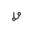
  <icon name="git-branch" width="28" height="28"></icon>
  <icon name="check-circle" foreground="success"></icon>
</row>
App icons and bound names
Two more value forms open the vocabulary without weakening it:
app:<name>draws an icon the app registered at boot withcanvas.icons.registerAppIcons(comptime-parse the SVG withcanvas.svg_icon.parseComptime). Declare the table aspub const app_iconson the app root and pass it toregisterAppIconsinmain— the model contract carries the same names, sonative checkverifies everyapp:reference against exactly what the app registers (with a did-you-mean). Without a fresh contract artifact the check degrades to structural checking and says so.icon="{binding}"defers the choice to model data — a field or function producing a built-in name or anapp:name per row (a status icon per item, a play/pause toggle). The contract checks the binding resolves to a string.
Both forms resolve at draw time with an honest failure mode: a name that resolves nowhere renders the missing-icon fallback (a slashed circle) and logs a Debug warning naming the value — visible and loud, never a silent gap.
<icon name="app:waveform" foreground="text_muted"></icon>
<button icon="{playPauseIcon}" on-press="toggle_play" label="Play or pause"></button>
Zig builder
ui.icon takes the name as a comptime argument — an unknown name is a compile error pointing at canvas.icons.known_icon_names.
ui.row(.{ .gap = 20, .cross = .center }, .{
    ui.icon(.{}, "play"),
    ui.icon(.{ .style_tokens = .{ .foreground = .text_muted } }, "search"),
    ui.icon(.{ .width = 28, .height = 28 }, "git-branch"),
    ui.icon(.{ .style_tokens = .{ .foreground = .success } }, "check-circle"),
})
Registry
The full built-in set (canvas.icons.known_icon_names), rendered by the engine.


























































































Attributes
name is the icon element's own required attribute: a comptime-validated built-in name, an app:<name> reference to a registered app icon, or one {binding} resolving to such a name (not part of the shared attribute vocabulary). The rest are the shared sizing and tint attributes:
| Attribute | Description |
|---|---|
width | Definite width (plain number): the element is exactly this wide; content neither shrinks nor overflows it. On resizable it is the initial width. |
height | Definite height (plain number): the element is exactly this tall; content neither shrinks nor overflows it. |
foreground | Foreground/text color token (literal ColorTokens field name, e.g. text, text_muted, success, warning, info). |
label | Accessible name; when set it REPLACES the element's text as the announced name - screen readers and automation snapshots see the label, never the text it shadows. |