List
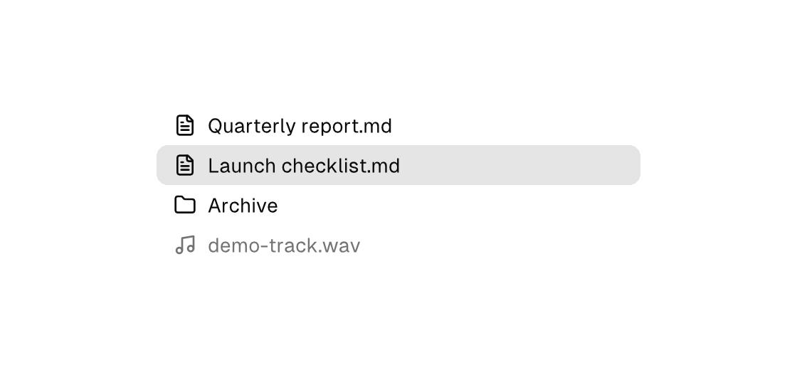
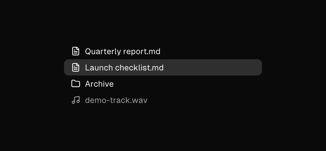
A vertical stack of items. The rows are list-item text leaves — the label is the content, icon draws a leading vector icon, selected marks the current row (usually an equality), disabled grays a row out, and on-press dispatches the row's Msg. For long data, virtualized with a fixed virtual-item-extent lays out only the visible window.
Markup
<list width="340" gap="2">
  <list-item icon="file-text" selected="{doc == report}" on-press="open_report">Quarterly report.md</list-item>
  <list-item icon="file-text" selected="{doc == checklist}" on-press="open_checklist">Launch checklist.md</list-item>
  <list-item icon="folder" on-press="open_archive">Archive</list-item>
  <list-item icon="music" disabled="true">demo-track.wav</list-item>
</list>
Zig builder
ui.list(.{ .width = 340, .gap = 2 }, .{
    ui.listItem(.{ .icon = "file-text", .selected = model.doc == .report, .on_press = .open_report }, "Quarterly report.md"),
    ui.listItem(.{ .icon = "file-text", .selected = model.doc == .checklist, .on_press = .open_checklist }, "Launch checklist.md"),
    ui.listItem(.{ .icon = "folder", .on_press = .open_archive }, "Archive"),
    ui.listItem(.{ .icon = "music", .disabled = true }, "demo-track.wav"),
})
Selection and activation
When selection is model state — the accent row your app owns — rows use the desktop gesture split: a single click selects (on-press), and the primary action (open the record, play the track) rides the double click and Enter. Bind the primary action twice — on_double_press for the pointer (Zig builder only; markup has no double-click event) and on-submit for the keyboard:
ui.listItem(.{
    .selected = model.selected == track.id,
    .on_press = Msg{ .select_track = track.id },      // click, and Space on a ring-focused row
    .on_double_press = Msg{ .play_track = track.id }, // double click: the primary action
    .on_submit = Msg{ .play_track = track.id },       // plain Enter: the same primary action
}, track.title)
The double click is additive, never a delay: the first click dispatches the select on its own release, the second release dispatches the play — select-then-act, with no press timer. On the keyboard, a bound on-submit makes plain Enter the row's primary action while Space keeps select; rows without one resolve Enter as select, unchanged.
The arrows stay app-owned after clicking around: pointer focus on a plain list row is quiet (no ring), and a quietly focused row routes no keys — arrows and Enter fall through to the app-level key fallback, where a selection-owning app moves its own selection. Tab onto a row draws the ring and restores the row's full keymap (arrows walk the rows, Space selects, Enter submits), and rows carrying role="treeitem" keep the tree's roving keymap under either register. The full routing order is in Native UI § Keyboard routing; examples/soundboard's track lists are the live reference for the whole pattern.
Virtualization
For long row sets, turn on virtualized and give each row a fixed virtual-item-extent — the engine lays out only the rows in view. Loop the model data with a keyed for and dispatch a payload per row. The rows still all BUILD (this bounds layout and paint, not the tree), so it suits row sets the model already holds — hundreds, not hundreds of thousands. For dataset-scale rows where the view should only ever build the visible window, use the builder's virtual list.
<list virtualized="true" virtual-item-extent="28" grow="1">
  <for each="rows" as="row" key="id">
    <list-item on-press="open_row:{row.id}">{row.title}</list-item>
  </for>
</list>
Attributes
List:
| Attribute | Description |
|---|---|
virtualized | Enable list virtualization (true/false). |
virtual-item-extent | Fixed item extent for virtualized lists (plain number). |
gap | Spacing between children (plain number). Rejected on stacking containers (stack, panel, card, the modal surfaces) — they layer children; put a column (or row) inside for flow. |
List-item:
| Attribute | Description |
|---|---|
text | Text value for text-bearing elements; a literal or one {binding}. |
icon | button, toggle-button, list-item, menu-item: vector icon drawn inline (buttons/toggle-buttons before the label, list/menu items as a leading slot): a built-in name (comptime-validated against canvas.icons.known_icon_names, e.g. save, plus, refresh-cw), an app-registered app:<name>, or one {binding} resolving to such a name. Icon-only buttons when the content is empty — add a label. One hit target, one enabled/disabled tint. |
selected | Selected state; often a {a == b} equality. |
disabled | Disables the control; true/false or a {binding}. |
on-press | Dispatch a Msg on press: tag or tag:{payload}. Legal on any element — a bound press handler makes it pressable, and presses on plain text/icons inside it fall through to it (dragging still selects text). |
on-submit | Dispatch a Msg on submit: tag or tag:{payload}. Enter in a text field, primary+enter in a textarea; on a list-item, plain Enter dispatches it as the row's primary action while Space keeps the row's select (on-press). |