Combobox
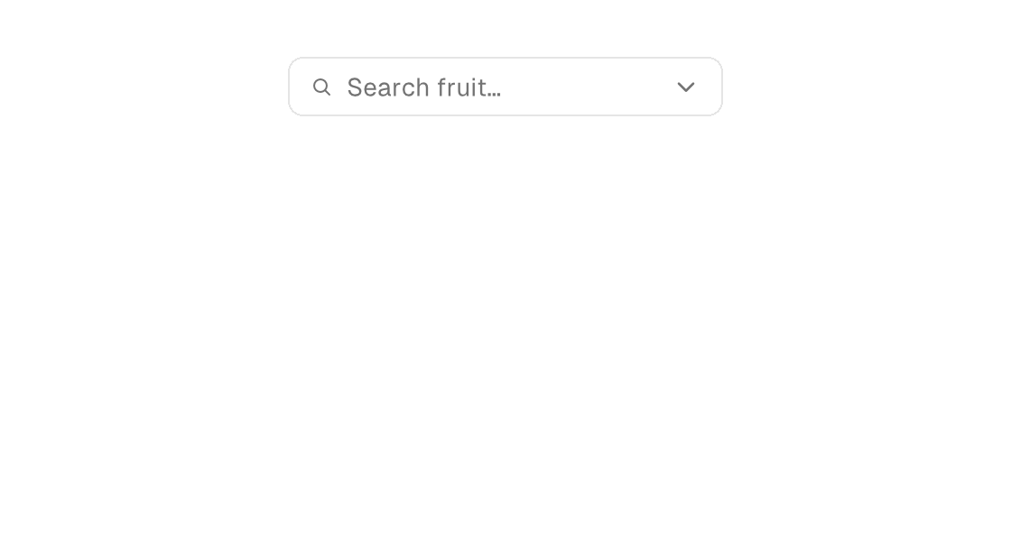
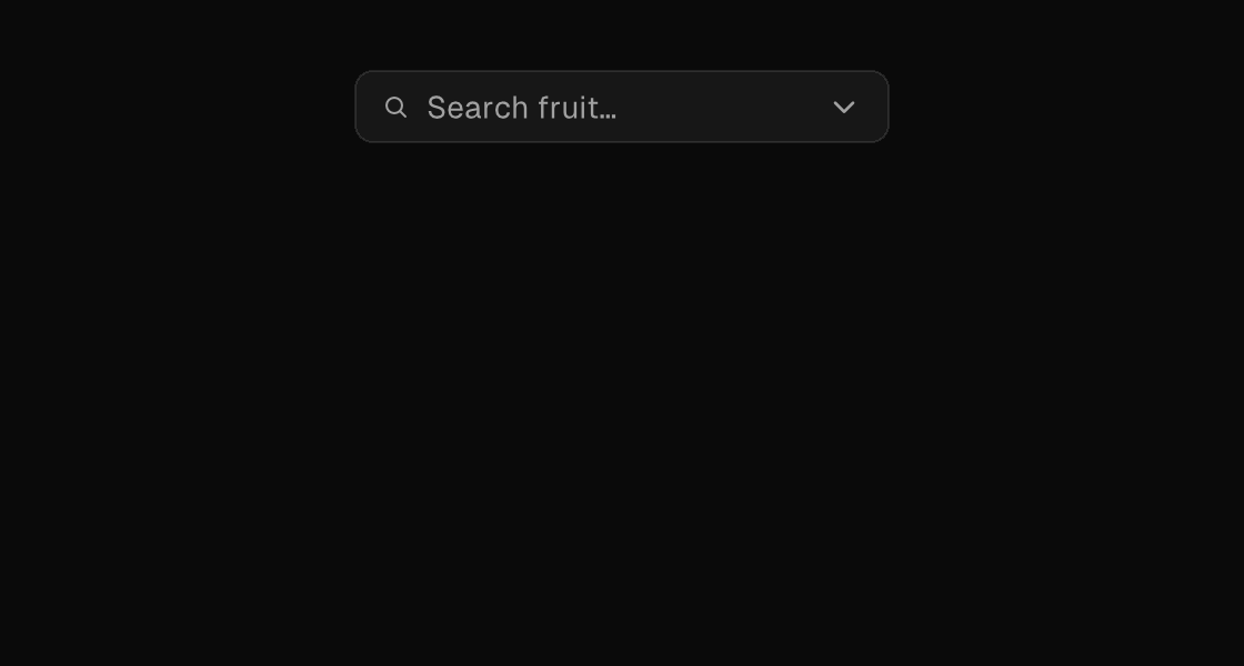
combobox is a trigger-only primitive like select, but the trigger is a text entry with a menu affordance: on-input names a Msg variant that receives every edit as a canvas.TextInputEvent, and the model filters the options as the user types. The options themselves are composed the same way as the select's — an anchored dropdown-menu of menu-items beside the trigger in a stack, rendered under an if, with on-dismiss clearing the model's open flag when Escape or a click outside closes the surface.
Markup
The model owns the query and the open flag; the for source is the model-filtered match list, so the menu narrows as the user types.
<stack width="240">
  <combobox placeholder="Search frameworks" text="{framework_query}" on-input="framework_edited" on-press="open_framework_menu" />
  <if test="{framework_menu_open}">
    <dropdown-menu anchor="below" anchor-alignment="stretch" on-dismiss="close_framework_menu">
      <for each="matchingFrameworks" key="id" as="f">
        <menu-item on-press="pick_framework:{f.id}">{f.name}</menu-item>
      </for>
    </dropdown-menu>
  </if>
</stack>
Zig builder
on_input takes a comptime message constructor: Ui.inputMsg(.tag) builds Msg{ .tag = edit } for each canvas.TextInputEvent.
ui.stack(.{ .width = 240 }, .{
    ui.el(.combobox, .{
        .placeholder = "Search frameworks",
        .text = model.framework_query,
        .on_input = Ui.inputMsg(.framework_edited),
        .on_press = .open_framework_menu,
    }, .{}),
    if (model.framework_menu_open) ui.el(.dropdown_menu, .{
        .anchor = .below,
        .anchor_alignment = .stretch,
        .on_dismiss = .close_framework_menu,
    }, .{
        ui.el(.menu_item, .{ .text = "Native SDK", .on_press = .{ .pick_framework = 0 } }, .{}),
        ui.el(.menu_item, .{ .text = "Canvas", .on_press = .{ .pick_framework = 1 } }, .{}),
    }) else ui.spacer(0),
})
Attributes
| Attribute | Description |
|---|---|
text | Text value for text-bearing elements; a literal or one {binding}. |
placeholder | Hint text shown while a text entry is empty. |
disabled | Disables the control; true/false or a {binding}. |
on-press | Dispatch a Msg on press: tag or tag:{payload}. Legal on any element — a bound press handler makes it pressable, and presses on plain text/icons inside it fall through to it (dragging still selects text). |
on-input | Names a Msg variant with canvas.TextInputEvent payload; delivers each text edit. |
on-dismiss | Dismissible surfaces only (dialog, drawer, sheet, dropdown-menu): Msg dispatched when Escape or a click outside dismisses the surface, so the MODEL owns the close (clear the open flag in update). The engine hides the surface immediately as an optimistic echo; the source tree wins on the next rebuild. |