Pagination
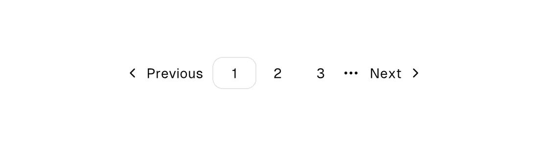
A row container for page navigation — children flow horizontally and are ordinary buttons: ghost page numbers with the current page carrying the outline variant and selected, chevron-left/chevron-right buttons for previous/next (icon-placement="trailing" puts the next chevron after its label), and an ellipsis icon standing in for a collapsed range. Each button dispatches its own Msg through on-press; the model owns the current page.
pagination

Markup
<pagination>
  <button variant="ghost" icon="chevron-left" on-press="prev_page">Previous</button>
  <for each="pages" as="p" key="number">
    <button variant="{p.variant}" selected="{p.number == page}" on-press="open_page:{p.number}">{p.label}</button>
  </for>
  <icon name="ellipsis" />
  <button variant="ghost" icon="chevron-right" icon-placement="trailing" on-press="next_page">Next</button>
</pagination>
The current page is the outline one among ghost siblings — the variant carries the currency, selected carries the semantics. In a for loop, compute the variant name on the row (p.variant returning outline or ghost).
Zig builder
ui.el(.pagination, .{}, .{
    ui.button(.{ .variant = .ghost, .icon = "chevron-left", .on_press = .prev_page }, "Previous"),
    ui.button(.{ .variant = .outline, .selected = model.page == 1, .on_press = .{ .open_page = 1 } }, "1"),
    ui.button(.{ .variant = .ghost, .on_press = .{ .open_page = 2 } }, "2"),
    ui.button(.{ .variant = .ghost, .on_press = .{ .open_page = 3 } }, "3"),
    ui.icon(.{}, "ellipsis"),
    ui.button(.{ .variant = .ghost, .icon = "chevron-right", .icon_placement = .trailing, .on_press = .next_page }, "Next"),
})
Attributes
| Attribute | Description |
|---|---|
selected | Selected state; often a {a == b} equality. |
on-press | Dispatch a Msg on press: tag or tag:{payload}. Legal on any element — a bound press handler makes it pressable, and presses on plain text/icons inside it fall through to it (dragging still selects text). |
icon | button, toggle-button, list-item, menu-item: vector icon drawn inline (buttons/toggle-buttons before the label, list/menu items as a leading slot): a built-in name (comptime-validated against canvas.icons.known_icon_names, e.g. save, plus, refresh-cw), an app-registered app:<name>, or one {binding} resolving to such a name. Icon-only buttons when the content is empty — add a label. One hit target, one enabled/disabled tint. |
icon-placement | Icon slot side on label-bearing buttons/toggle-buttons: leading (default) draws the icon before the label, trailing after it — the next-page chevron. Icon-only buttons center the glyph regardless. |